Fun with Franchises: Our Favorite Images from Pirates of the Caribbean: The Curse of the Black Pearl
One of the recurring features that we do in Fun with Franchises (a feature within a feature) is, after we finish watching a film, we go through and pick out our favorite images from that film. These images could be anything from really famous images from the film or franchise, really beautifully composed shots, shots that are funny to us because of the facial expressions being made in them or because of what we said about them in the article in which they appeared, or simply because they have boobs in them.
What we usually do is, just how we watch the films, Colin and I go in separately and pick out about ten to fifteen shots that we really liked. Then we compare lists, and whichever ones we both picked automatically go on our final list. And everything else we talk through and discuss why we like them, and eventually we’re left with a final list of ten images we liked the best, along with ten honorable mentions, which were also as good, but just missed out on making the list proper.
It’s not very complicated (like most things we do here on B+ Movie Blog), and is just a way for us to point out shots that we really liked in the films, especially since we tend to pick stuff that’s not always on the beaten path. (We also don’t officially rank the list of shots. We just put them in chronological order. Simply picking them is hard enough. We don’t want to make our lives any harder. Plus, we’re lazy.)
That said — here are our favorite images from Pirates of the Caribbean: The Curse of the Black Pearl:
This is how I wake up every morning.
Let’s get started with my intro shots, which are numerous this week, as this film was terrifically shot. This is a film that was clearly planned down to the frame, and it shows. You don’t have the kind of visual planning in the sequels that you do in this film. This film is special. It’s fun, it has a classic character, and it looks good.
We’ll start as we must —
You don’t find many pairs of titties better than those.
Colin:
And then we’ll continue with something you know we love — rear projection. The great thing about this film is how they make it obvious, yet tasteful. My favorite kind. Just like the 40s. And then they do it on a larger scale as well, which I’m a huge fan of. This is how you do rear projection in the modern age, people. More of this.
Also, you guys know how much I love when stuff reminds me of old Hollywood, and backlots.
And irises. Especially when it’s through a spyglass. It’s a diegetic iris.
And you know I love me some good framing.
And then — this location is just nice.
Then — this is framing plus silhouette. These just barely missed making the article.
Then — this shot was gonna make it — Colin and I both picked this, only it was too similar to a shot we both chose from Revenge of the Sith, and since there were a lot of choices, and I don’t like to repeat things we already picked, it went here. But it’s still a really nice shot.
Apocalypse Now much? (That’s not a bad thing.)
Look how crisp this explosion is.
I also love Revolutionary War imagery.
And good underwater cinematography.
These two shots we both really liked, and were gonna put later on the list with another shot, but I didn’t want to clutter the list with extraneous shots. Case and point — we both really liked the underwater shots with the fish, and you can basically consider it an addendum to the list. I just didn’t want to put like four shots on a single entry all the time.
And then — this shot. I love how they set this up. It’s a simple image, yet it’s really good. There’s something really powerful about this shot, in all its simplicity. Colin wasn’t as big a fan of it, and, if it were just me doing this, I’d have put this on. But we had lots of choices, so I left it here. But I love this shot.
This shot is just hilarious to me. In context and out of context.
This is the pirate movie in a single image.
And finally — this is the second franchise in a row with a Smell My Fingers shot. I didn’t catch that during editing, but this image is HILARIOUS out of context. Aye, sea turtles, indeed.
– – – – – – – – – –
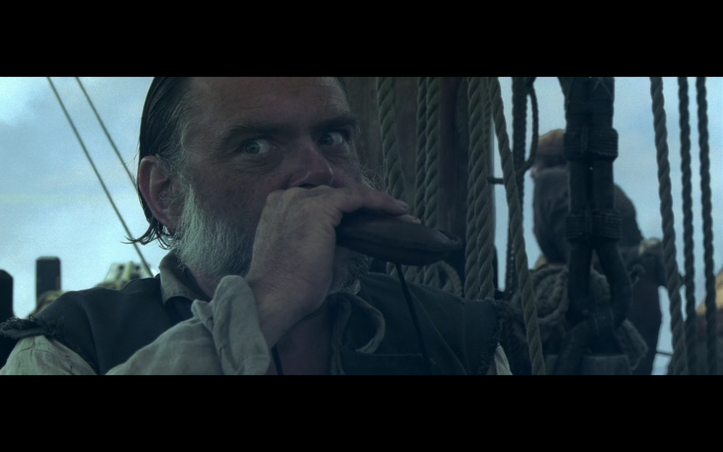
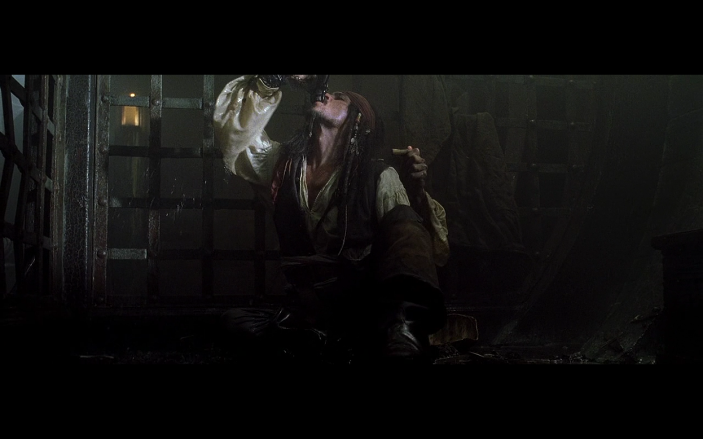
And now we’re going to start with an unofficial #1. We were gonna make this an official entry on the list, but we felt it was better to not subject all the other shots to having to compete with these.
Because if given the choice, we’ll take the seasick crocodile booze every time.
So here are a bunch of shots of people drinking in this movie.
It’s an effective pregame, I feel:
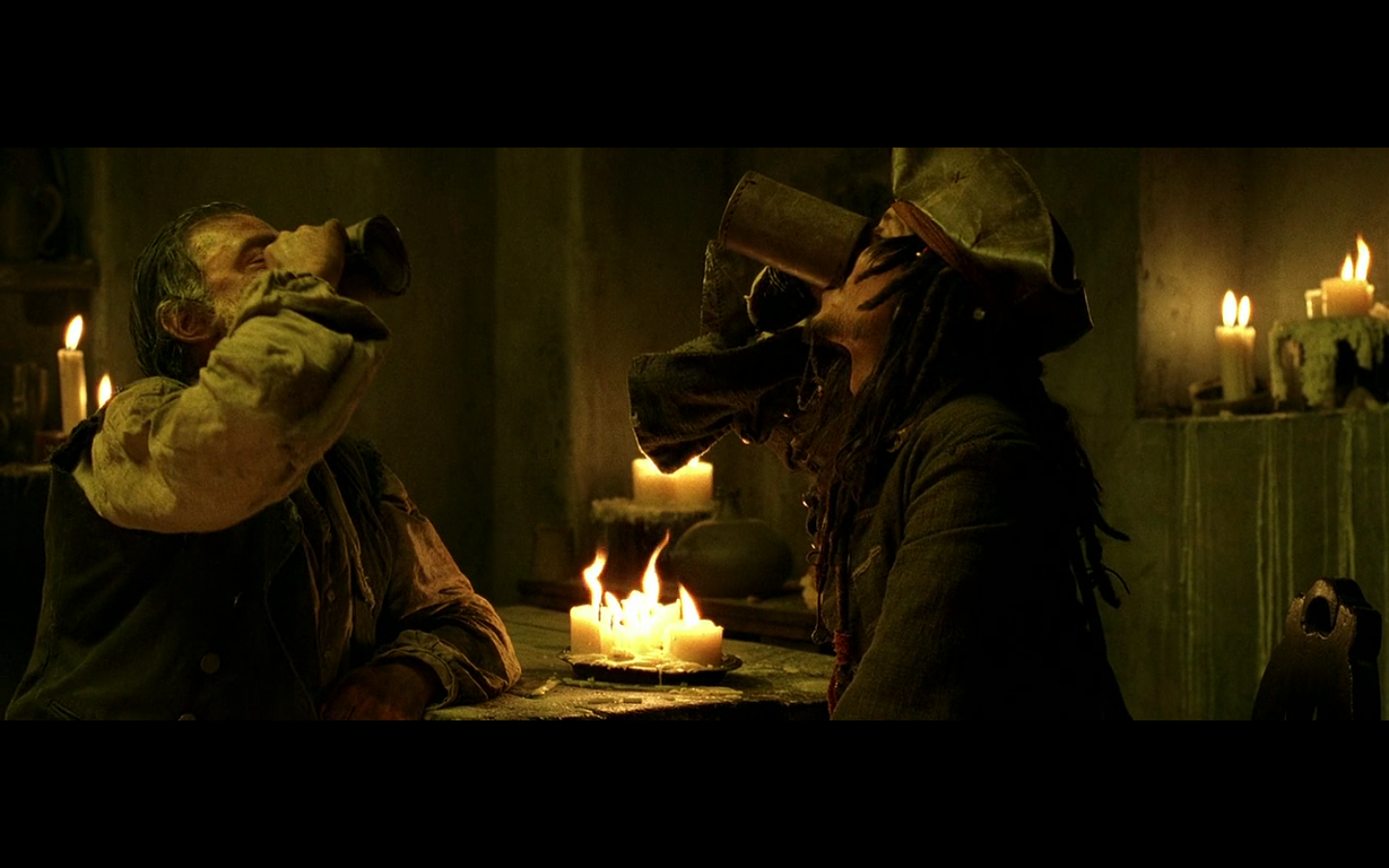

Welcome to the Caribbean, indeed.
(P.S. that third to last one of Gibbs might be my new favorite thing. I want to drink and give foreboding eyes at people all the time now.)
– – – – – – – – – – –
Onto the list:
1. This image
This looks like a painting. It’s a gorgeous image, and is one of my absolute five favorites in the movie. It takes a strong image to look like a painting and not try to. Especially when it actually looks like a painting.
Colin:
Two things about this work for me. First, the wall’s curve makes for excellent shading. Very much like oil on canvas. And second, it’s pretty grainy as an image. Or at least, it isn’t super crisp. This really is shot in such a way — intentional or not — that makes the details look a little bit fuzzier or a bit more obscure. Just enough that it looks like a gorgeous painting and not enough for it to look blurry.
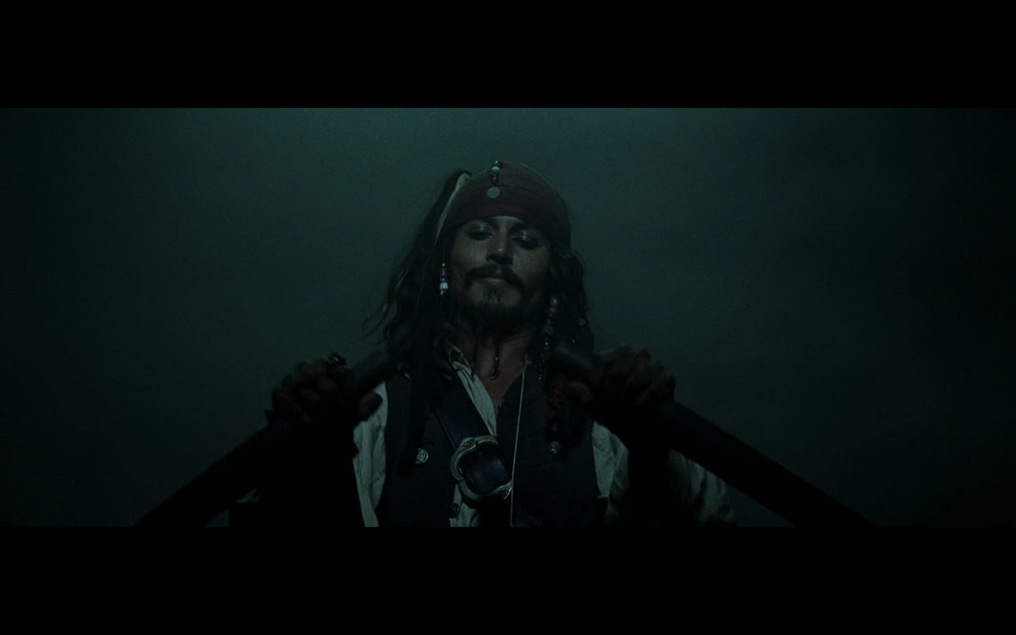
2. Captain Jack Sparrow
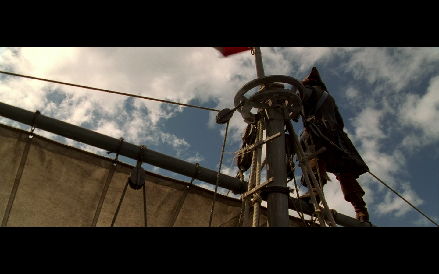

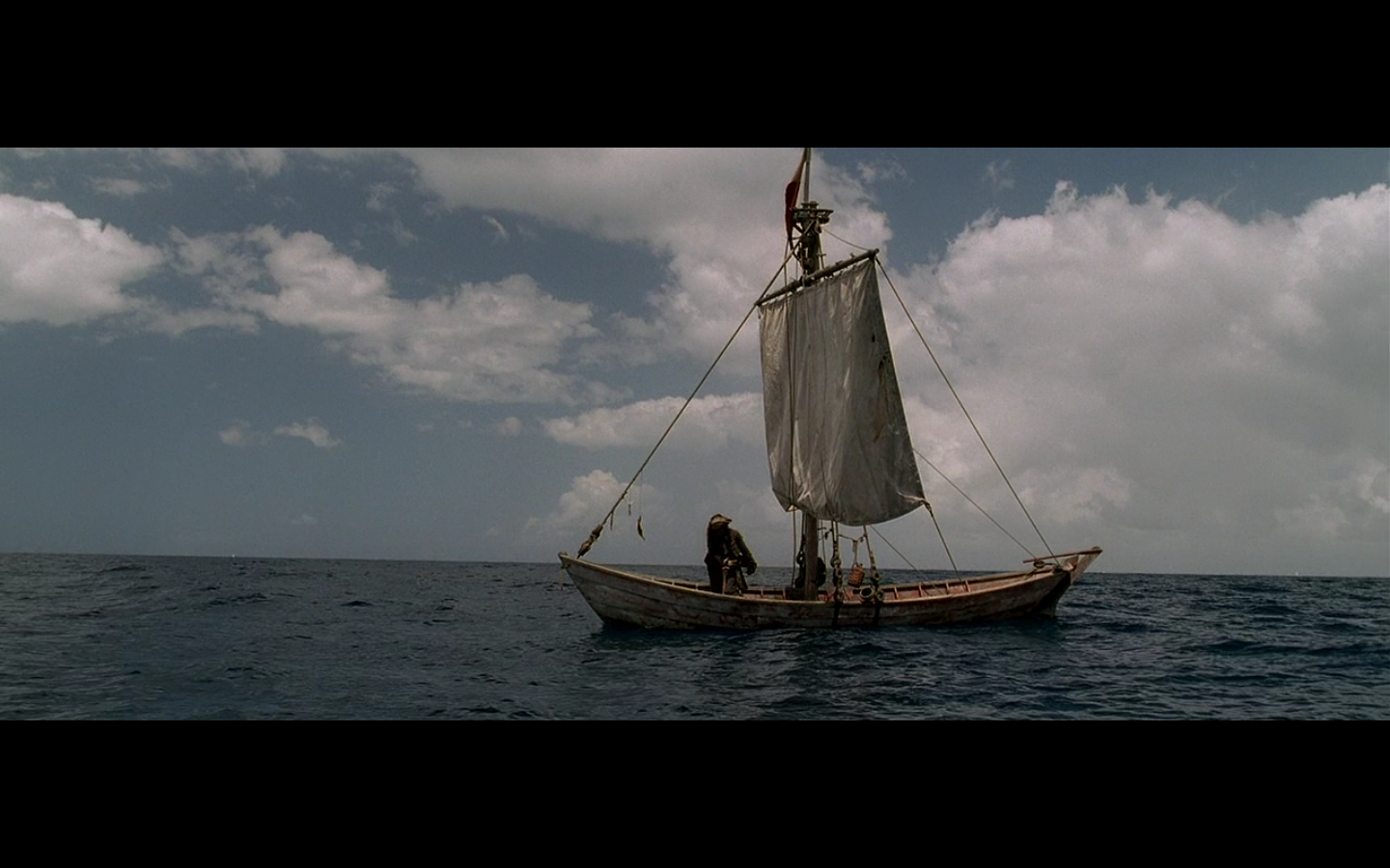
This is one of my favorite character introductions in all of cinema. It’s so good. You get him looking like a boss on top of the sails, then we pull back and reveal the tiny ass boat that’s also sinking, until finally he arrives right on time at the dock, just as the ship fully goes underwater. It’s the character in a nutshell and is absolutely incredible. And the score stays completely epic throughout and never once winks at the audience and ruins the joke. That is a huge benefit to this moment.
Colin:
This really is one of the best character entrances ever. At least one of the best main character introductions we’ve ever had in the franchises. Let’s think about this. Harry Potter is introduced as a baby. Luke’s a whiny teenager haggling over second-hand farm equipment. Frodo’s reading a book under a tree. Bella Swan…was being pale? And emo? In Phoenix? And now this. What an awesome entrance, both in terms of the pose and the shot itself. I love this whole moment. Although, I’d be remiss if I didn’t include my favorite franchise’s first entrance — Sean Connery in Dr. No. That shit is so great. How they don’t show his face, and then reveal him lighting up the cigarette as his theme starts to play. “Bond, James Bond.” But this is masterful, as far as franchise entrances go. Doesn’t hold a candle to — holy shit, I just realized that technically, The Thin Man is the first film of a franchise — Nick Charles’ entrance.

I’d also like to point out how big a fan I am of the entire character arc over the course of this film, as we meet him in those shots, he’s immediately made likable to us, he’s a memorable character, we know nothing about him, yet we know he has a history and has done some shit, most people hate him, everyone knows him, his motives are entirely unclear, and we never really find out what he’s thinking from moment to moment. It’s the basis of a brilliant character (which unfortunately they fuck up by the third movie), and then the ending ties a perfect bow on it. Him, getting the one thing he wants in the world back, saying “Bring me that horizon.” It’s an absolute perfect character arc.
3. This place
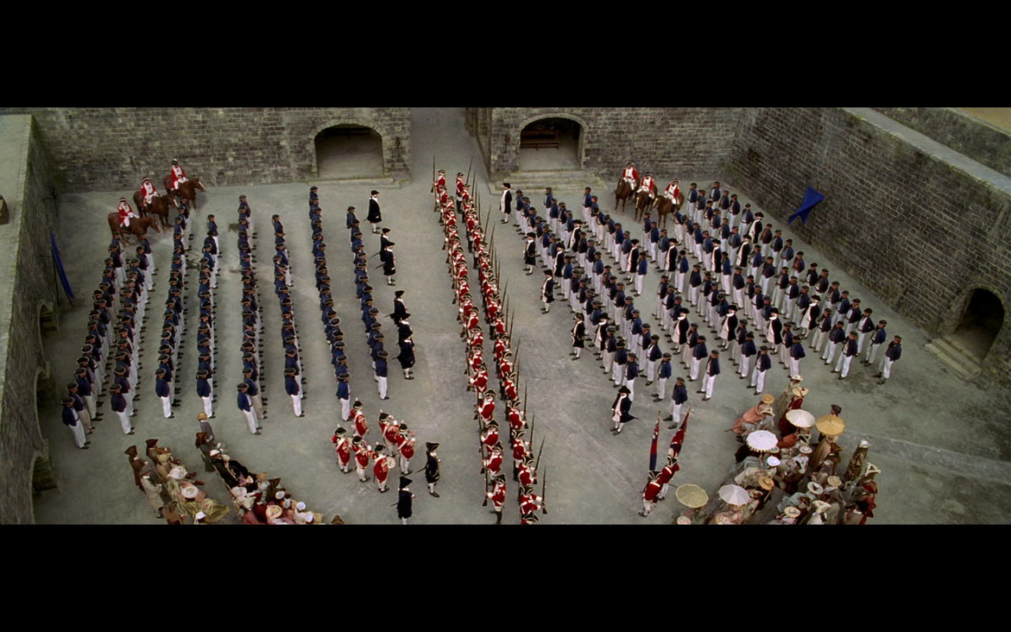
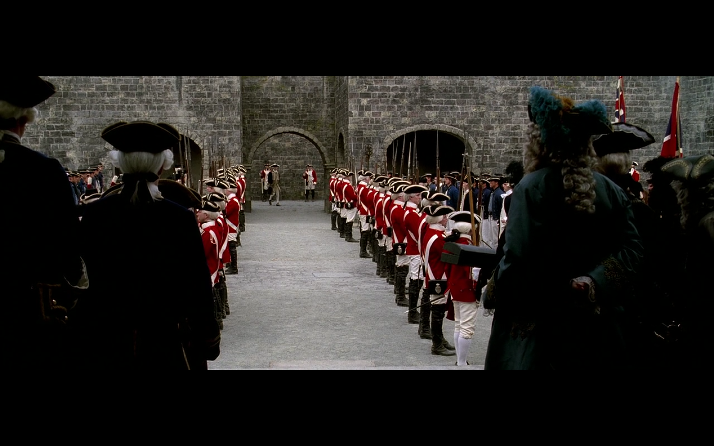
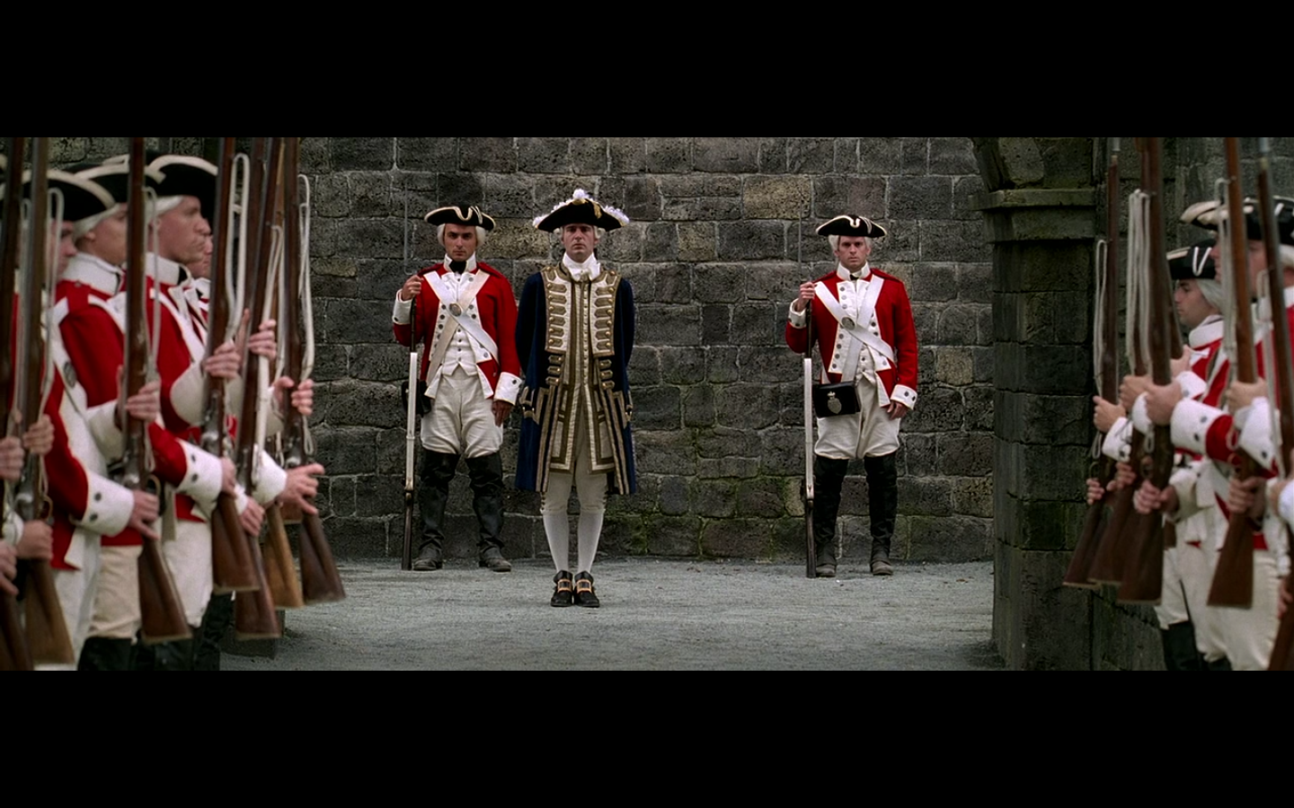
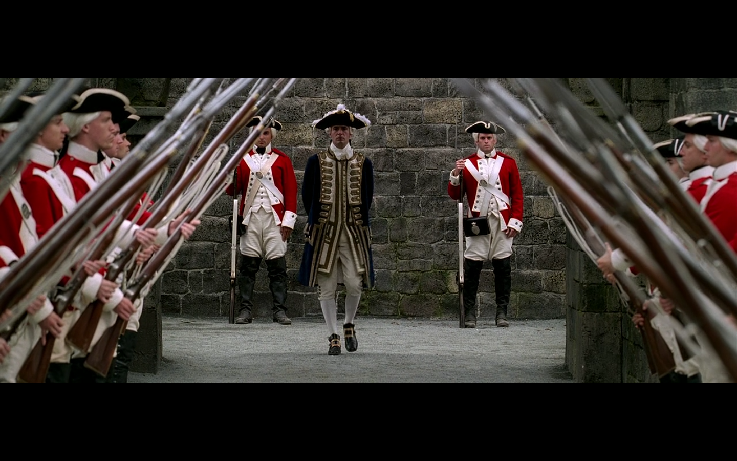
Shot 1 — incredible. That could be one on its own. The second one — symmetry. The third one — I love a person in colorful clothing framed against a stone wall. (The great thing about these articles is — we’re all learning how to make a good movie. This is really all you need instead of film school. Watching stuff like this and seeing what works and what doesn’t.) Stone really makes colors pop. And the fourth one — the bayonets are up and they create a nice frame around him, on top of all that other stuff.
Great stuff.
Colin:
I really love stone as a building material, but I could never piece together why I like it on film. Mike’s absolutely right — it makes colors pop. Something about it as a background makes things better. I love it. This whole conversation made me take a break from this article and go back to watch the sword fight between Errol Flynn and Basil Rathbone at the end of The Adventures of Robin Hood. Cause that shit looked good.
That cinematography holds up today, that’s how good that looks. There’s something about 1938/1939 color that really jumps off the screen and looks better than anything we’ve done since. Robin Hood, Wizard of Oz, Gone with the Wind — even Drums Along the Mohawk — that color is still the best I’ve ever seen on screen. That era.
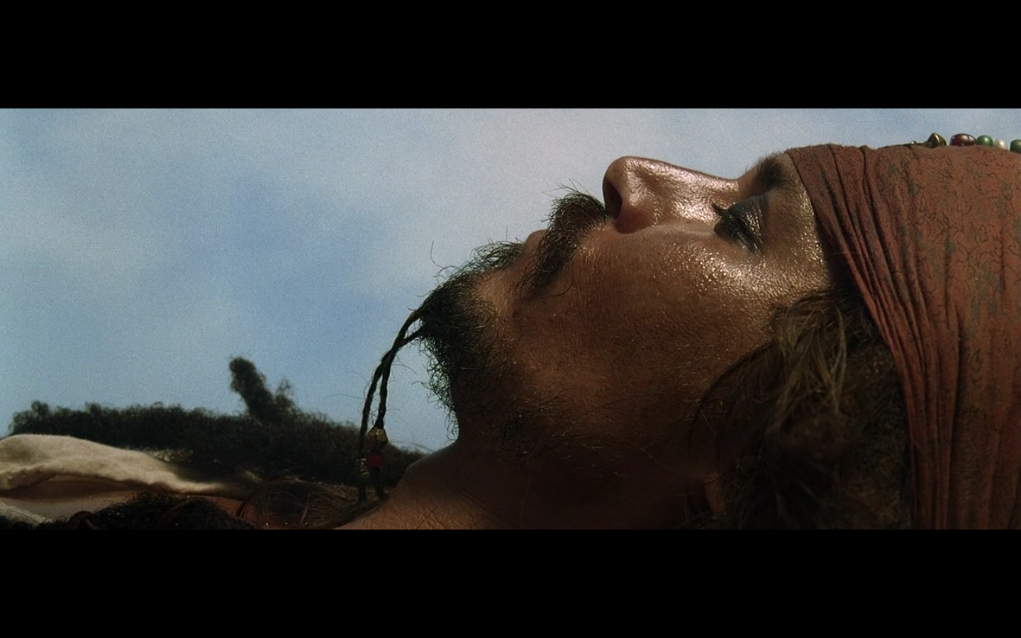
4. This shot

Colin:
For my part, I was surprised Mike didn’t mention this shot in the articles. I was trying to figure out whether he hadn’t noticed it, or if there was something else about it that somehow messed up the lens flare/silhouette effect going on here. I chose not to add anything about it since he hadn’t said anything, but lo and behold, here it is. I don’t know much about film filters or how different equipment works, but I can imagine that if Twilight had tried this, it’d have looked gaudy as hell. Like, weirdly too crisp, or too bluish. This looks pretty classy.
I deliberately didn’t say anything about this in the articles, because I didn’t want to call too much attention to it. This is a shot that goes completely unnoticed during the watching of the film, and even during the synopsis. I was going to write how there were so many images in this film (like #1 on this list) that are almost completely throwaway in context, yet are absolutely gorgeous images on their own. But that would have tipped this too much as being an inclusion on this list, and since this is my single favorite image in this film, I didn’t want to call too much attention to it, since I like how under the radar it is and I want to maintain that.
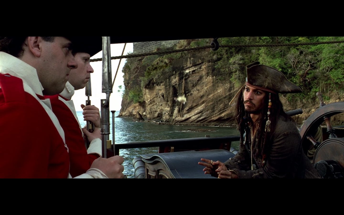
5. “And then they made me their chief…”
Colin:
I’m an enormous fan of this image. Even just him talking to the two goons is, by itself, hilarious. We left the scene with them pointing their guns at him, threatening to shoot if he didn’t cooperate and come up with the story. And now, as we return to the scene, he’s clearly got them in the palm of his hand, just chatting them up about being a pirate. And it’s a TALE. “And then they made me their chief.” It’s so dramatic, so adventurous; as though he was telling the story of Where the Wild Things Are. I really can’t effectively explain why this is so funny, and why this is a perfect line for them to return to him saying. But if you’re like me at all, you get it. And on top of that, there’s a chick falling out of the sky, framed by their heads. Uh, yeah.
This is a perfect image. Story and visuals combine into a perfect visual punchline.
This is filmmaking, people.
6. Ships at Sea
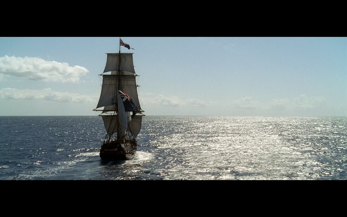
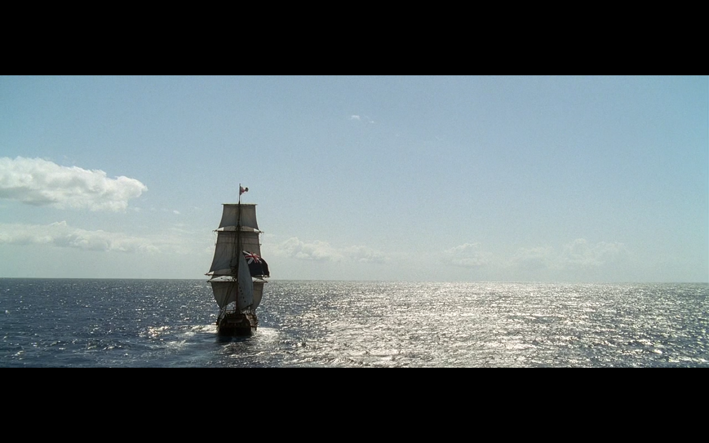
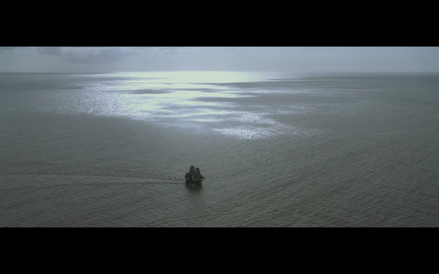

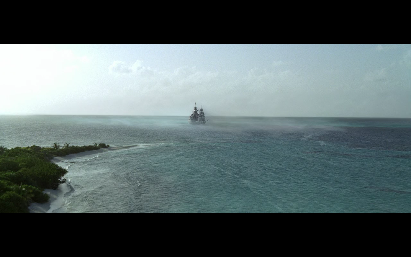


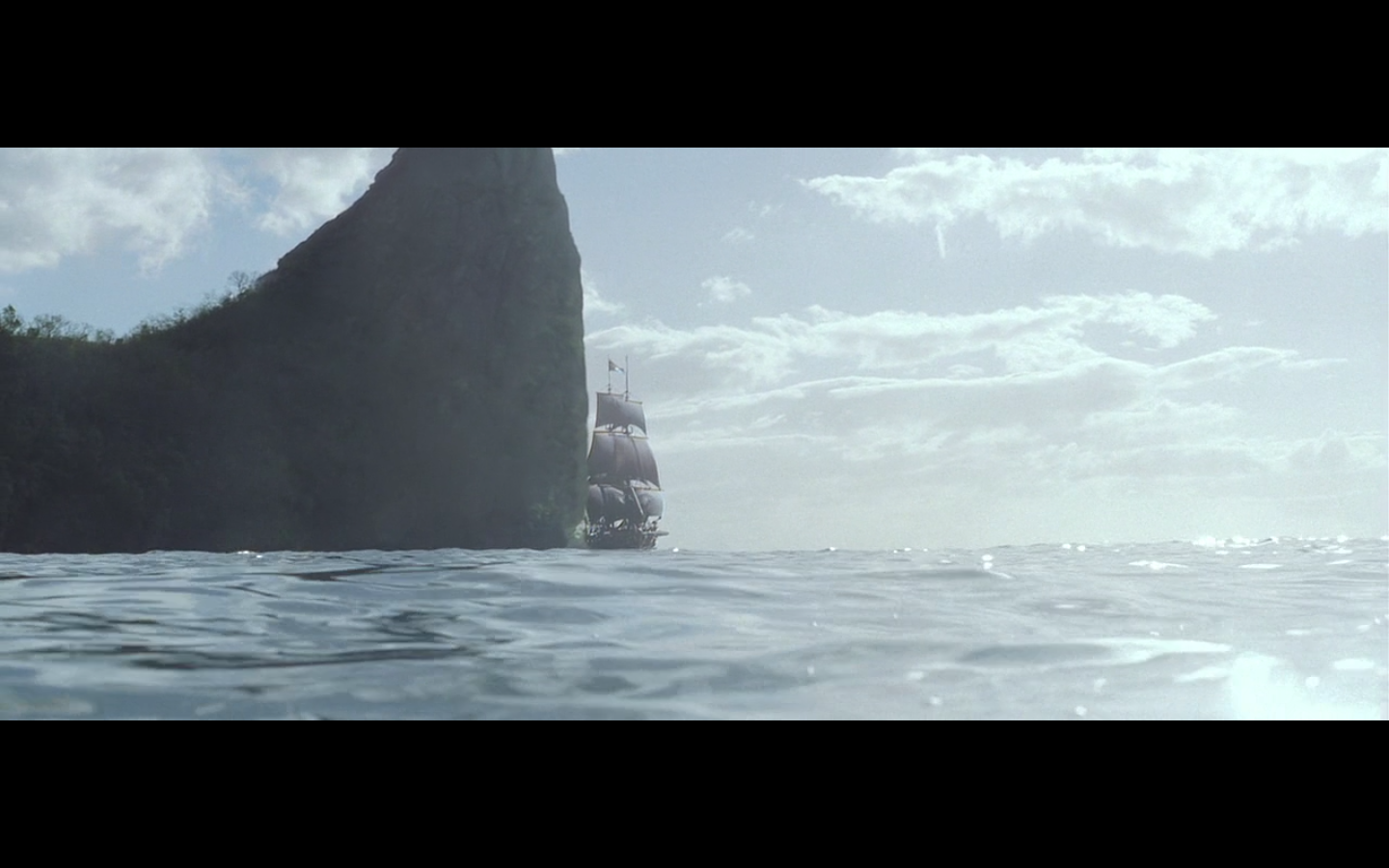
They speak for themselves. They’re all money shots.
And I threw in the one on the island because — come on. Look at it.
Colin:
(Water + Boats) x Wide Shots = AWWWW YEAHHHH
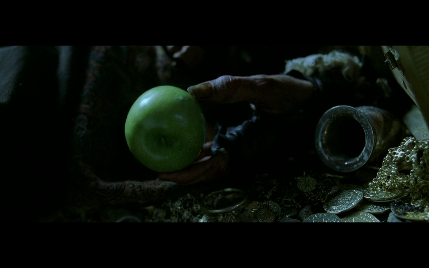
7. How do you like them apples?
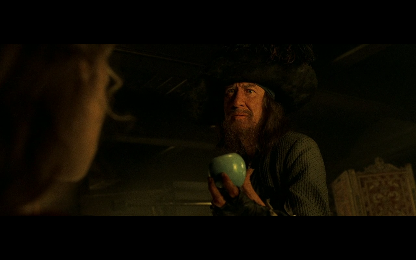
Look at his faces in these shots. These are absolute perfection. Also part of my top five favorite images from this movie.
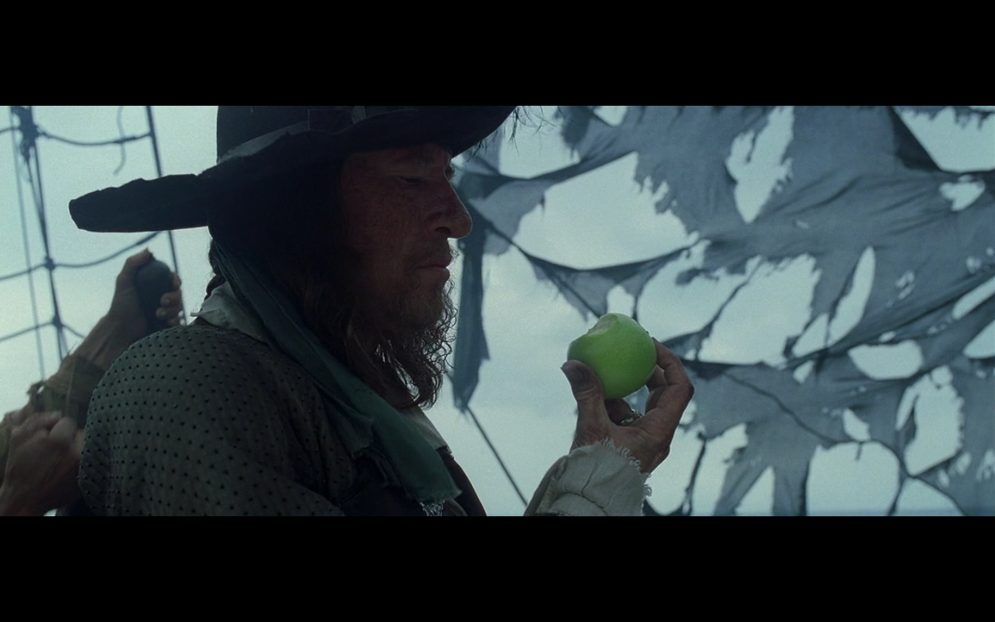
Colin:
I like all of these, but the only one I really chose and argued to put on here was the one of him staring at the apple on deck before chucking it overboard. It’s just…someone just staring at an inanimate object furiously. It’s kind of a cool way to look at their curse. On one hand, he’s sort of all-powerful — on the other hand, he takes this apple that Jack was enjoying and can’t do shit but look at it, even though he wants to eat it BADLY. So he just looks pissed at it and ends up chucking it. Especially after making the quip about searching people when they’re dead and then chuckling as he has Jack locked in the brig, it’s only when he looks back at the apple that he gets really pissed off. But the whole series of shots is pretty nice, too. Just as a trademark thing, and having a manifestation of Barbossa’s desire to have his curse lifted.
That’s why I really love this last one, since it’s a nice little visual thing, with him and the apples, and this final shot of him works really well because of all that. They established the apple motif, and then he dies, and we get this.
It makes no sense in context, at all. Since we don’t see him holding the apple, but the strength of the visual makes it not matter at all.
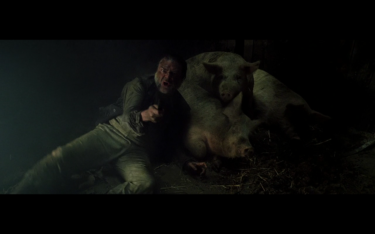
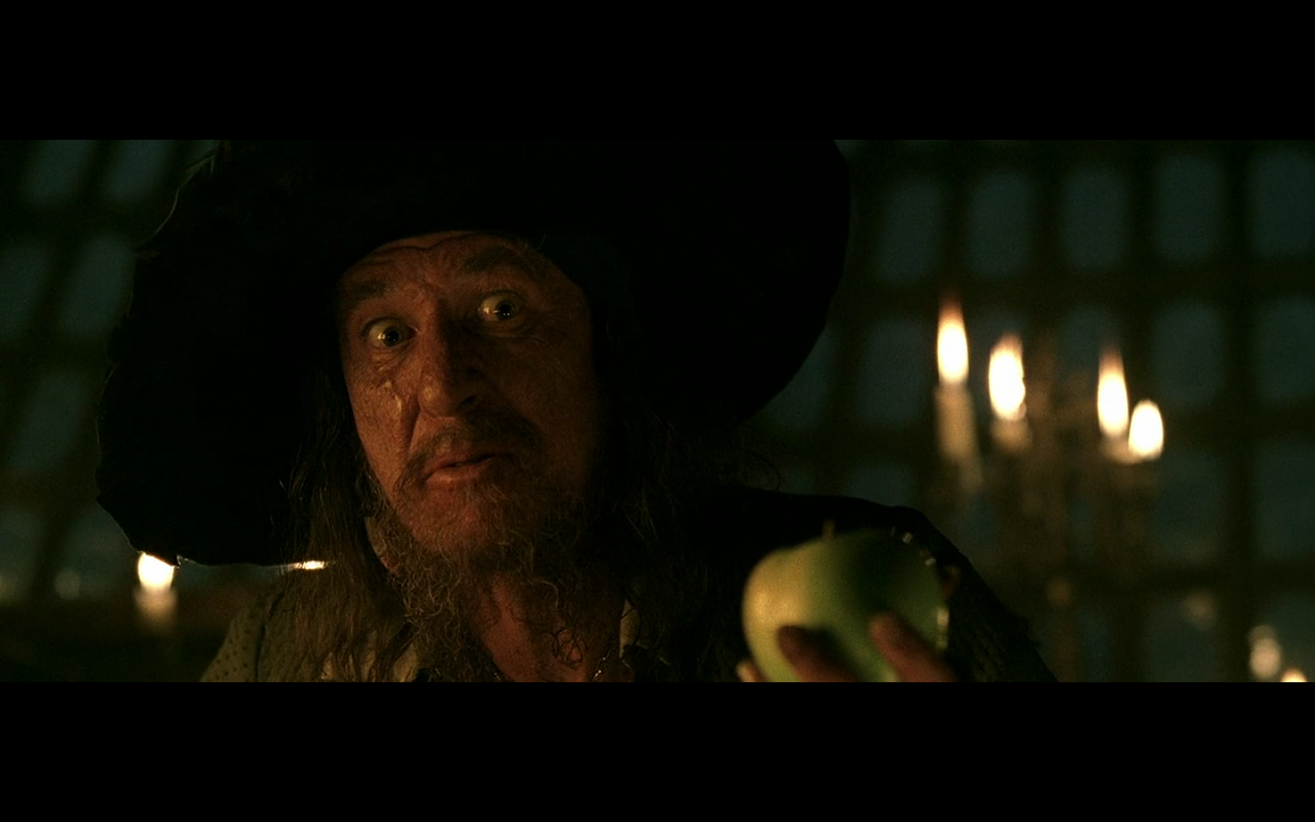
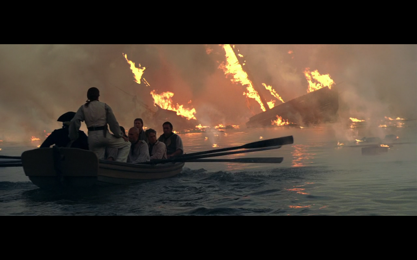
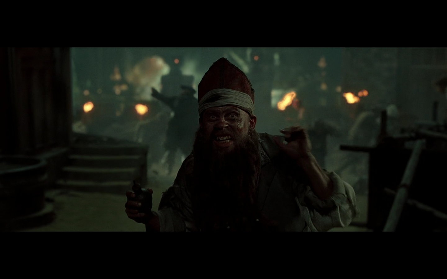
8. ARRGGHH!
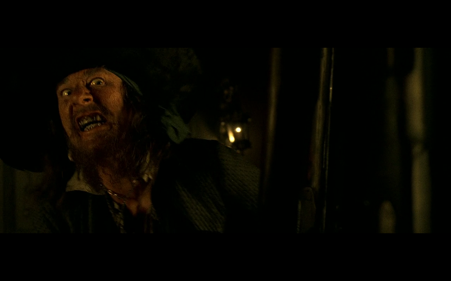
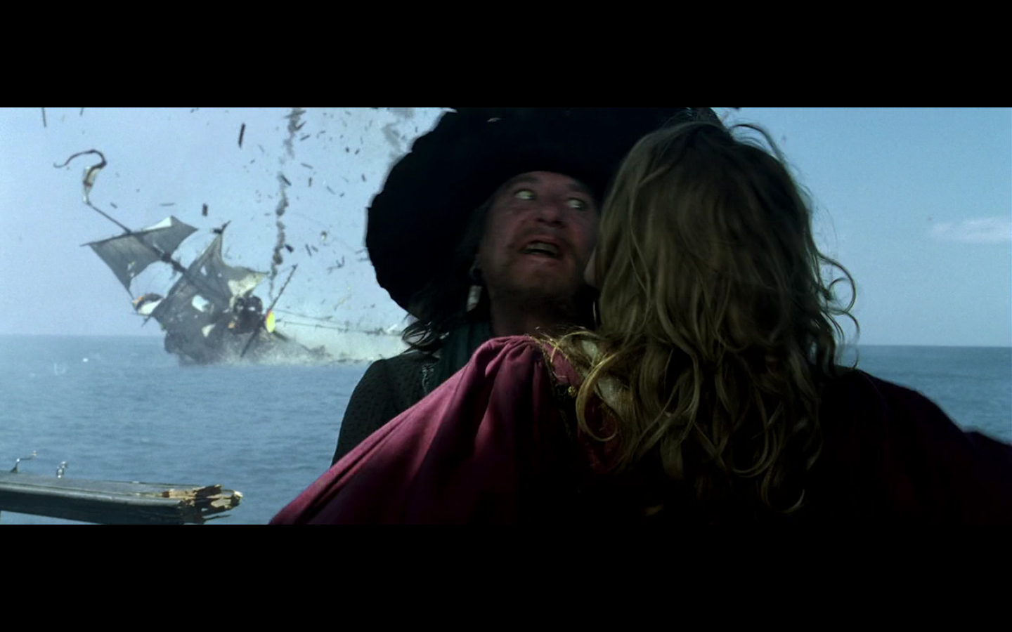
The first face speaks for itself, but the second one is the one I love, since he’s doing that face and there’s a ship on fire and sinking in the background. That’s a fucking image. I didn’t catch how great that was until I was pulling for this article. That second one is a perfect image.
Colin:
Geoffrey Rush does crazy eyes and nasty teeth REALLY well. The second one is awesome, if only because it’s a ship blowing up and that because of Michael Bay, I now associate explosions with the word ‘awesome.’
9. This shot
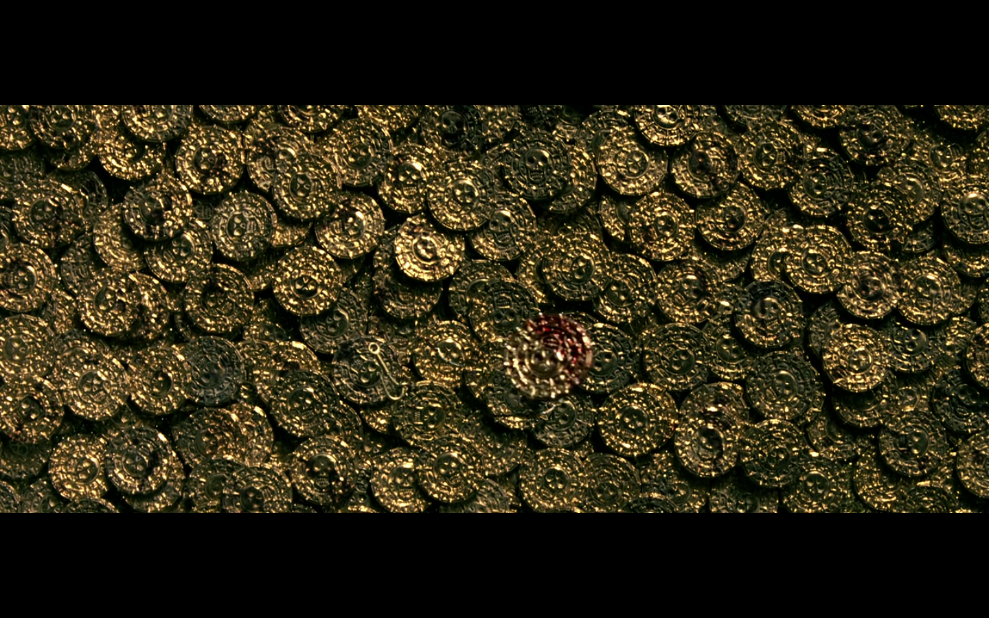
Because it’s a nice fucking shot. You know it, I know it — it’s here. Deal with it.
Colin:
Yeah, this was happening. It’s a great image. A lot of coins. No border. I love shots like this. You all knew this was happening.
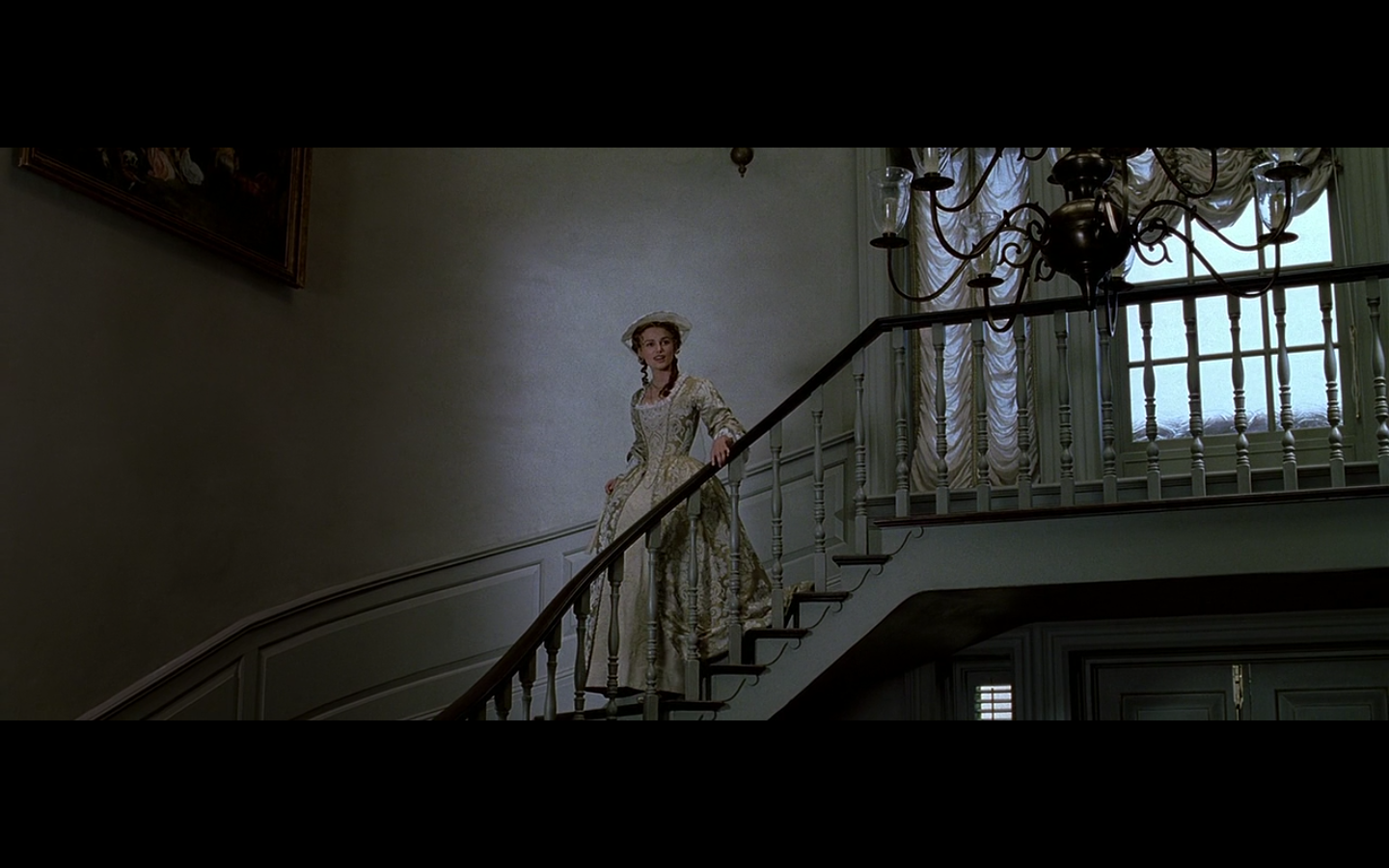
10. Simple Jack (and Keira)
It’s the simplicity of the image that makes this work. It’s just his face, and the blue background behind it. We’ve gone on about this before (especially in Twilight, where simple images of a character and a monochrome background were the ones we liked the most), but these kinds of shots really are quite perfect in their simplicity.
And this one works because it’s the same thing. You get the comedy cut of him rowing away, self-satisfied that he’s gotten one over on Norrington and his men, but you also have the nice shot of just him, in the boat, with fog behind him. It’s such a simple shot that it just works.
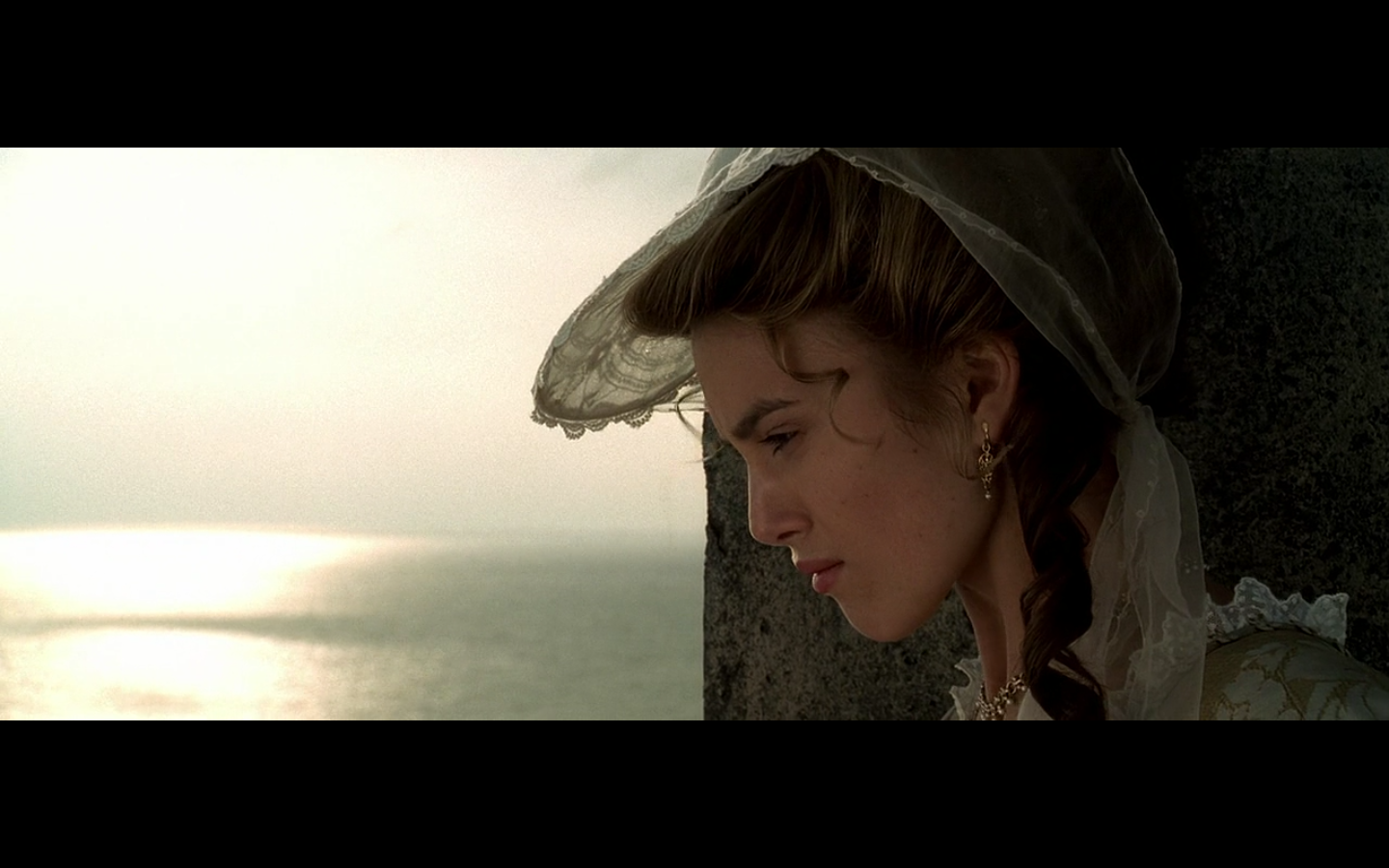
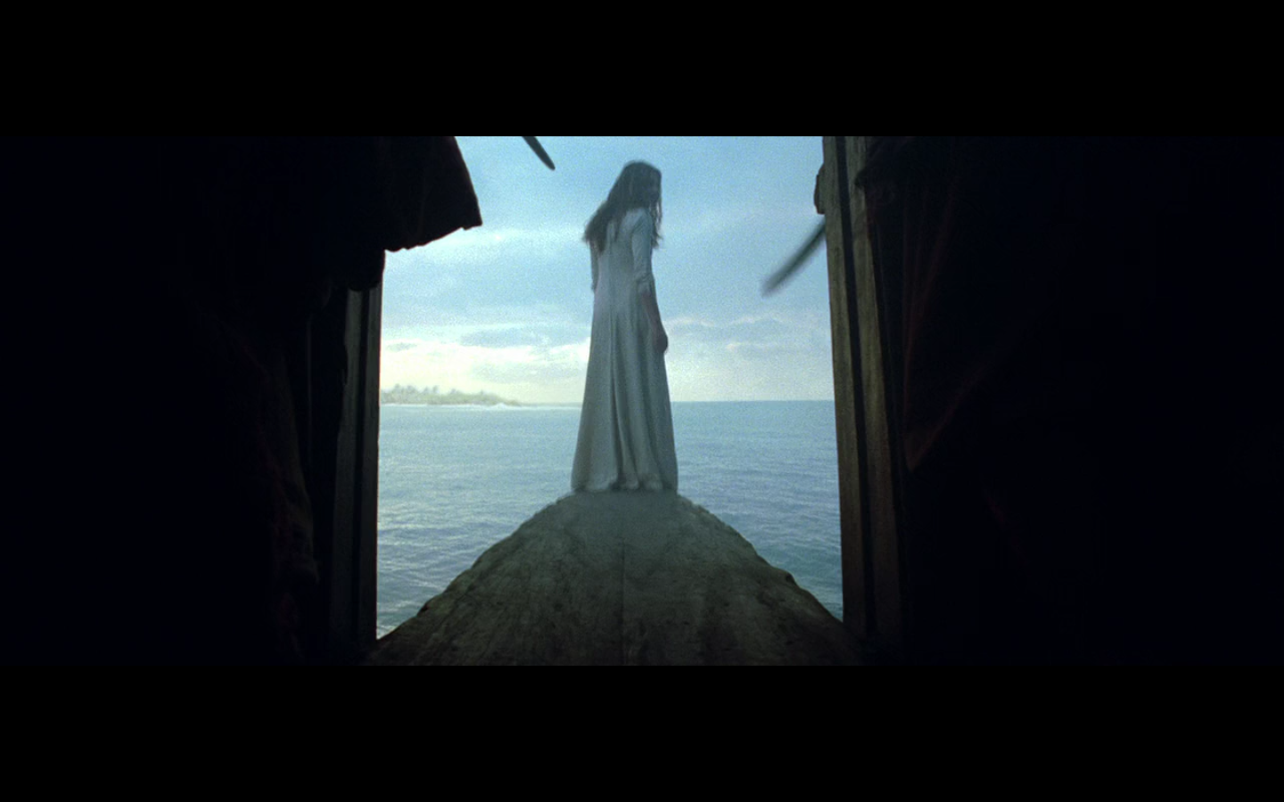
And this one — I snuck it on because it looks so nice. It’s almost a pair with that sunlight one from earlier, but I put it here because of its simplicity and beauty more than anything. It’s Keira, the water, the sun, and the stone behind her. That’s it. Simple, and absolutely stunning as an image.
Colin:
I love all of these. There’s no way these weren’t making it on. The first one is hands-down one of my favorite shots in the film. For a different, [not so much] lesser film, this could be a suitable poster image. You get the dreads, the beard, the skin, the eyeliner…it’s all there. And it’s on a blank blue background (try saying those three words five times fast). I think that last point is why all of these work. The second image is him looking satisfied as hell, probably with himself. And the background is this velvety, black mist. And then there’s Elizabeth up close, with only sky and ocean taking up the other half of the frame. Any other time of day or night, and this doesn’t work — but at JUST this time, the sun hanging low in the sky refracts a huge amount of light off the water, which gives the sea and the sky a similar color. The sky is whiter and darker than usual, and the water is whiter and brighter than usual. I love how that worked out to give the background a washed-out sort of feel, as opposed to the robin’s egg blue – navy blue horizontal split you’d get anytime from like 6am til like 8pm.
– – – – – – – – – – –
And now onto the honorable mentions…
– – – – – – – – – – –
Honorable Mentions:
- Ship on Fire
Colin:
I said the dim lighting and billowing smoke sort of reminded me of Gone With the Wind, and it really does. I mean, being at sea doesn’t really help the comparison, but those aspects of it certainly did make me draw that connection. I also love longboats. And he’s doing a Captain Morgan pose. That’s this guy’s job. To look at shit with one leg up.
He had me at “reminds me of Gone with the Wind.”
- This shot
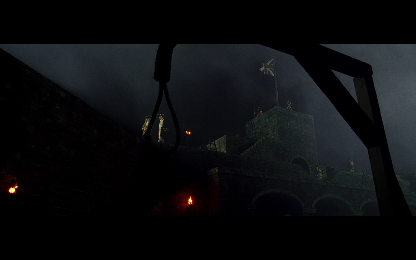
This is fucking glorious. The image speaks entirely for itself.
Colin:
Why more things aren’t framed by nooses, I’ll never know. Ox-Box Incident-ally, this ends up being something of a recurring theme in this franchise, which I really appreciate.
- The Chinaman
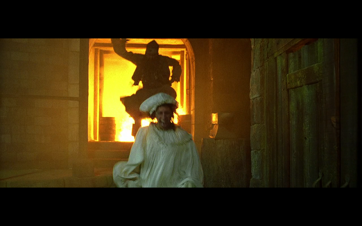
The first image is so ungodly hilarious to me. A Chinese dude (even though he’s not, but fucking look at it) chasing a woman with fire in the background.
And the second one is there because it’s so funny to me how much joy this dude takes in blowing shit up. That moment later on when his bomb doesn’t go off, Orlando Bloom is ready to fuck him up (this is after he’s taken an axe to the back, by the way, and lived), and then he gets hit over the head with a bottle and passes out, and the Chinaman laughs and jumps up and down and runs away — it’s so fucking enjoyable. It’s literally something out of Méliès, the way this dude jumps up and down so happily and how he chases women across the frame.
Big fan of this guy.
Damn shame what happened to his innards.
Colin:
Mike calls this guy The Chinaman, and I didn’t really see it until I saw this top image. And it actually reminds me of one of the dances that Tintin does in The Blue Lotus when he’s in Chinese garb, pretending to be a crazy person. Yes, this racism is killing me, but there is some resemblance in the pose. Personally, I just enjoy that this franchise has a Crazy Harry. I always loved him on The Muppet Show as a kid. The guy that shows up and blows things to pieces.
- This shot
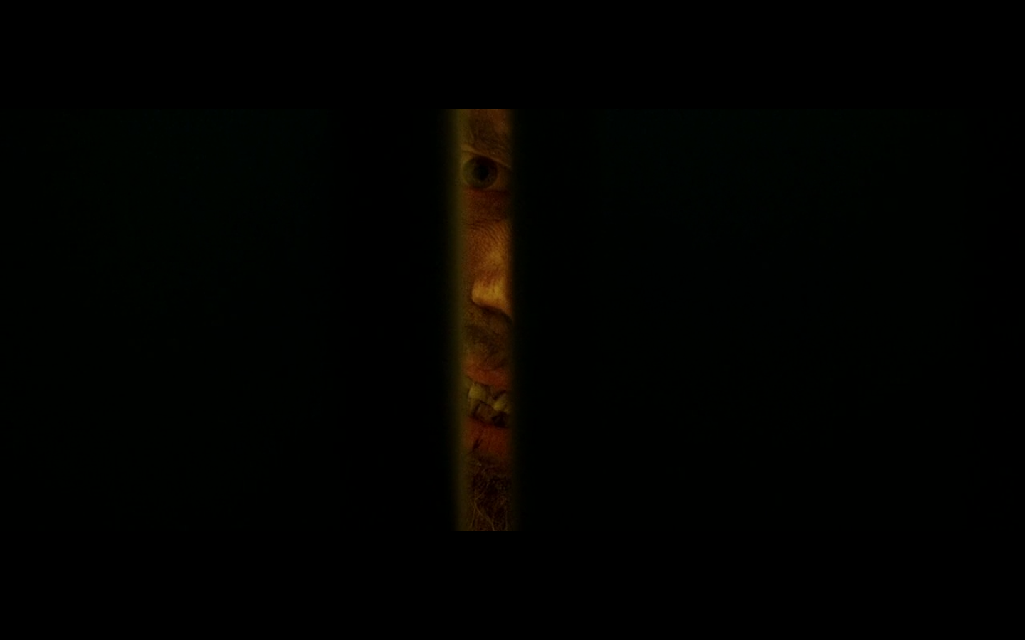
Colin:
Okay, I did try to convince Mike to put this one on, and it’s purely for my personal reasons. This is terrifying to me. I don’t know why, but the idea of being hidden in a closet (the R. Kelly story) or a small room with no way out (like her hiding from Nicholson in the bathroom in The Shining? Although, there ended up being a way out there, but you know what I mean) makes me crazy. Liv Tyler in the pantry in The Strangers, and the masked dude coming to the door, this, The Shining…these are all moments where if it were me, I would go numb and try to detonate myself in a nuclear explosion the instant they open the door. It’s way scarier to me because this tiny crack represents your only route of escape and that entire hole is now covered by the thing which is trying to kill you. Your only escape route is now blocked by the thing you’re most afraid of. And that’s WAY worse than being in the woods, with something chasing you, for instance. This shit is over.
It’s not so much that I didn’t like this shot, I just felt it was a bit simple for inclusion on the list, and was a bit too obvious a choice. But the more I looked at it, the more I liked how all you can see is the one little sliver of light with his face in it, and nothing else. I’ve chosen things like that before, when the frame is reduced to a small area, so it makes perfect sense for this to be something I’d go for. I really like the fact that all you have here is just the little crack in the doors and the rest is just black.
- This reaction
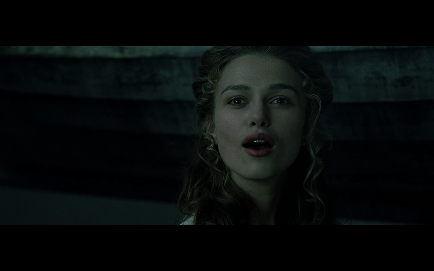
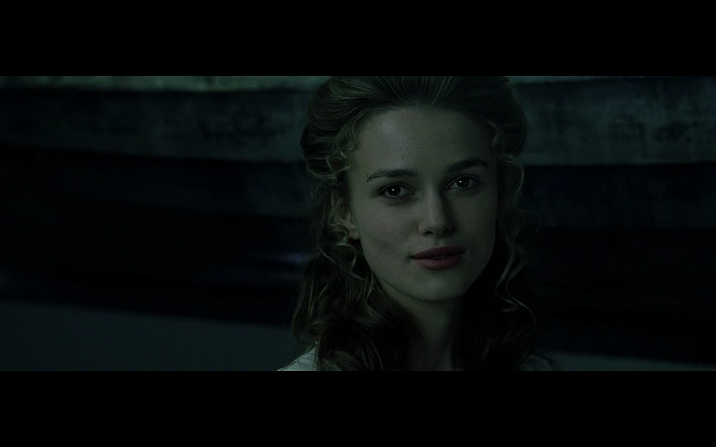
I fucking love this look. “Oh, so it does mean something to you… you fucked up.” It’s that putting the head down and giving that second look that makes it work. And it’s so much better that she doesn’t say anything. The power of facial acting really shows through here and makes this a shot I’d rather have on this list than some of the more… “visual” ones.
Colin:
“Ah, so I DID assume correctly that you’d care. Well, well, well. Someone fibbed.” I love this reaction, and I’m really glad Mike felt the same way. This is such a good moment, especially since she doesn’t say anything. Her face covers EVERYTHING we need to know about this moment. They freak out, and she does this. “OH! So you DID care! well, now I’m in charge, aren’t I?” And Keira does this perfectly. Gotta give her the credit.
- This shot
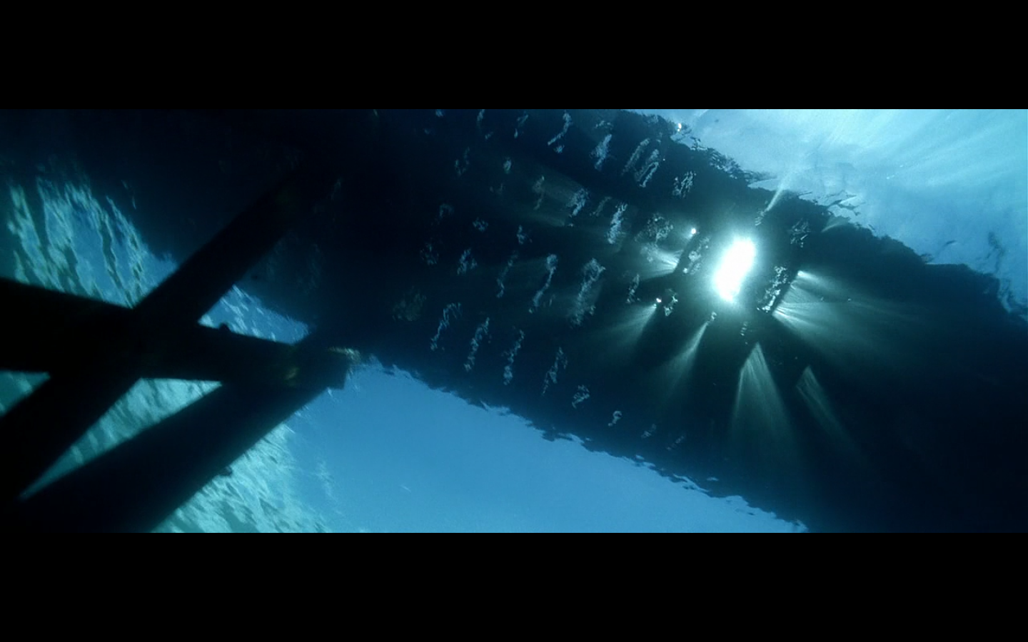
Colin pulled this one out. It looks nice. I wasn’t such a huge fan of it when I passed it, but, the more I look at it, the more I’m fascinated by it. It’s the angle. Looking straight up from underneath the dock. There’s really no purpose for it at all, and yet — it looks good. The sunlight coming down. It’s really quite an amazing shot.
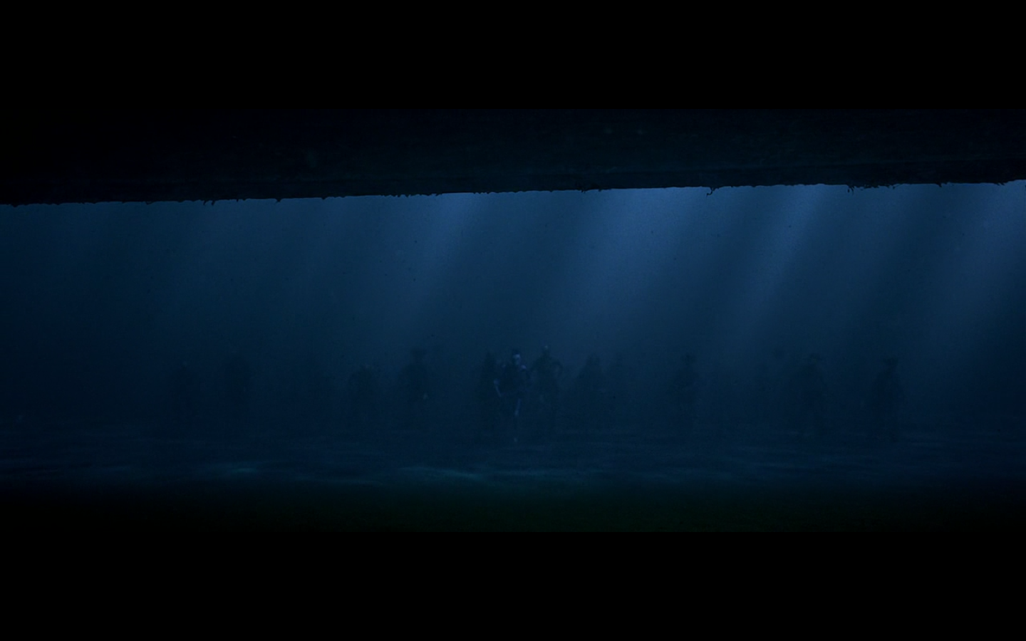
And then we snuck this on here to get it on. Because it’s underwater, and it’s the image that was blatantly stolen last film. It’s kind of the “y’all are surrounded” shot for this franchise. The thing that makes this work, though, is the fact that the bottom of the ship frames the entire top of the image, which is absolutely terrific.
Colin:
That first image, I love because — yeah. The second one seems too easy to choose, but the main reason I love it isn’t because there are skeleton dudes walking across the seabed, nor is it because the moonlight is coming down through the water — it’s because the ship is framing the top part of this shot. I really like it when things frame the tops of shots. It looks nice, and it should be done more often. It makes things more interesting. I’m automatically more interested in this shot because the top of the shot isn’t a perfectly straight, horizontal line.
- Happy Jack / Sad Jack


The smile is terrific. And the shot looks really good too. It’s a perfect shot to have as a screenshot.
And then the second one is funny because he’s so unhappy, yet all decked out in jewels and shit.
Colin:
Happy Jack is happy. And that’s cool. But to me, it’s all about Sad Jack. There’s something so great about this image of him decked out in jewels and finery making a totally sour face. He’s accepting his fate, which at this point is to be hanged. And he’s coming to terms with this while covered in gold and precious stones. It’s funny to me in the same way it is when you see a kid super excited for his first day of summer vacation burst out the front door in a bathing suit and sunglasses, and with an inflatable inner tube around his waist, only to be met with a comically ominous thunderstorm. You can’t rain on someone’s parade much more than this.
What I love about it as well is how understated it is. This shot is just there. Unless you’re really paying attention, you don’t necessarily see the comedy of the image in real time. They could have also, quite literally, rained on his parade by having a coincidental thunderstorm break out at that moment, which would have completely killed the moment and made it hokey. So I’m glad they went completely understated with the visual humor.
- This shot
I had this on my list, but Colin didn’t, so I figured, “I’ll just put it in the intro. It’s kind of an obvious choice.” Plus it’s a little blurry, so I was just going to put it on my intro list. But then I showed it to Colin and he was really excited about it, so — here it is.
I can’t remember any other pirate film where they used this exact angle. It’s a really great image. And we’ve established how I like when they reduce the frame like this.
My only wish is that the sides were clearer, without the swords and the guy’s coat hanging in there. Then it would be absolutely perfect. But still — good enough. The image is what counts.
Colin:
I hadn’t noticed this, and I’m glad Mike pointed it out. Look at it. Plank, swords, ocean, victim. I love this composition. This is a FANTASTIC shot.
- When the Rum Is Gone
I put the first one in there to get the wide shot, but the joy is in the reaction when he finds out she got rid of all the rum. It’s a mix of “I’m going to kill her” and “I can’t kill her with this gun.” It’s a great reaction.
Colin:
I love the second image. That might be my actual favorite image of the film. He’s making this pose because he legitimately can’t deal with the situation. It’s a combination of fear, panic, confusion and despair. I know his exact feelings in this moment without him saying a word. And that’s good acting. That’s why I can look back on his Oscar nomination and say that it makes sense. In fact, I’d vote for him. Didn’t he get the SAG nomination? Penn won that year, right? I’d probably have Depp and then Murray. Cause Murray was awesome, too. But this performance was so awesome and simultaneously NOT typically modern Oscar-like. This was the shit.
It’s pretty funny how he got nominated for an Oscar, because the performance is worth it, but when you look at it from afar — he got nominated for a pirate movie. It’s like thinking, “Julie Andrews won an Oscar for Mary Poppins. What?”
But yeah, he won SAG that year, and I was legit happy about that. And then Sean Penn won (for no goddamn reason at all, since the performance wasn’t that incredible. He just had the one scene where he screams and that’s about it. They gave it to him for his body of work. I thought he was much better in I Am Sam in ’01. And of course in Milk) over Bill Murray, who was also incredible that year. I’d rather them have gone Murray than Penn, but I’d still vote for Depp here. It’s between him and Murray, and I’d go Depp all the way, because how fucking fun would that be if they gave him an Oscar for playing a pirate? But, William Powell didn’t win for The Thin Man, so I guess it’s only fitting.
Oh, by the way, did you guys know? I can talk about any Oscar category at length at the drop of a hat.
Just in case you guys had thoughts about the 1929 Best Director category.
- This shot
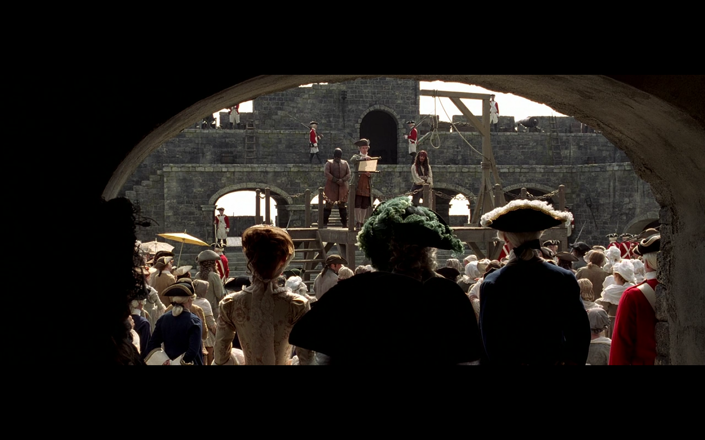
I couldn’t wait to get this one on. This is a glorious image. First, we’re back at the fort, so, stone walls and overhead arches. And now, the arch is framing the top of the shot, which we’re well-established fans of. And then you get the deep focus, and the three of them in the center foreground, Depp in the background, and all the awesome stone walkways and doors and shit in the very back. Big fan of this shot.
Colin:
More framing at the top of the shot. Yes. And the backs of these characters. This is a pretty perfect setting shot. This has everything; all the elements we like. Overhead framing, stone backgrounds to pop out colors, nooses…everything.
And then I’d also like to point out this shot, where you get the wide shot of the arch, with Keira in the back being framed by sunlight again. This is fucking beautiful too.
– – – – – – – – – –
Tomorrow, we do our final thoughts, and Monday we start Dead Man’s Chest.
(See the rest of the Fun with Franchises articles here.)

Leave a comment