Mike’s Favorite Movie Posters of the Decade (10-1)
I’ve said it for near ten years now — the movie poster is a lost art. So many of them nowadays are just so bland, and it feels like it’s getting harder and harder to get a poster that truly feels like something special; selling a film on a single, memorable image. Getting you to understand immediately what the film is about while also staying in your mind. It’s hard to remember posters. If I told you offhand to name ten truly memorable posters from this decade off the top of your head, you’d have trouble doing it. And even if you got to ten, chances are some of them are just because the film was so big and widespread that you remember it just because it was so out there.
Anyway, the point of this list was me looking back on my years of going over my favorite posters (and I started this list in 2011, so I’ve done nine years of it officially on the site) and revisiting all the posters from all the years and picking out the ones that I think have held up to me as the best examples of truly strong imagery.
So, with that said, here are my favorite posters from this past decade:
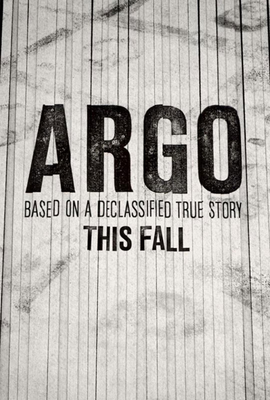
10. Argo
I feel like this list is mostly going to be comprised of posters I have (and do) randomly shout out whenever the topic of posters comes up, just because I remember them so well and love them so much. This one is one of the more genius ones I’ve ever seen. Since this is a bit of a tough story to try to sell. You can’t really visually sell the CIA pretending to be a film crew to save Americans hiding in the Canadian ambassador’s house in Iran. And selling it on just the star(s) is boring. This, though — the shredded paper is just so good. Because before now, this was hidden from history. They destroyed the evidence and hid it for a long time. And just the visual of a poster looking like shredded strips of paper is just brilliant. Absolutely brilliant. I must have brought this up in conversation dozens of times over the past decade because of how good it is.
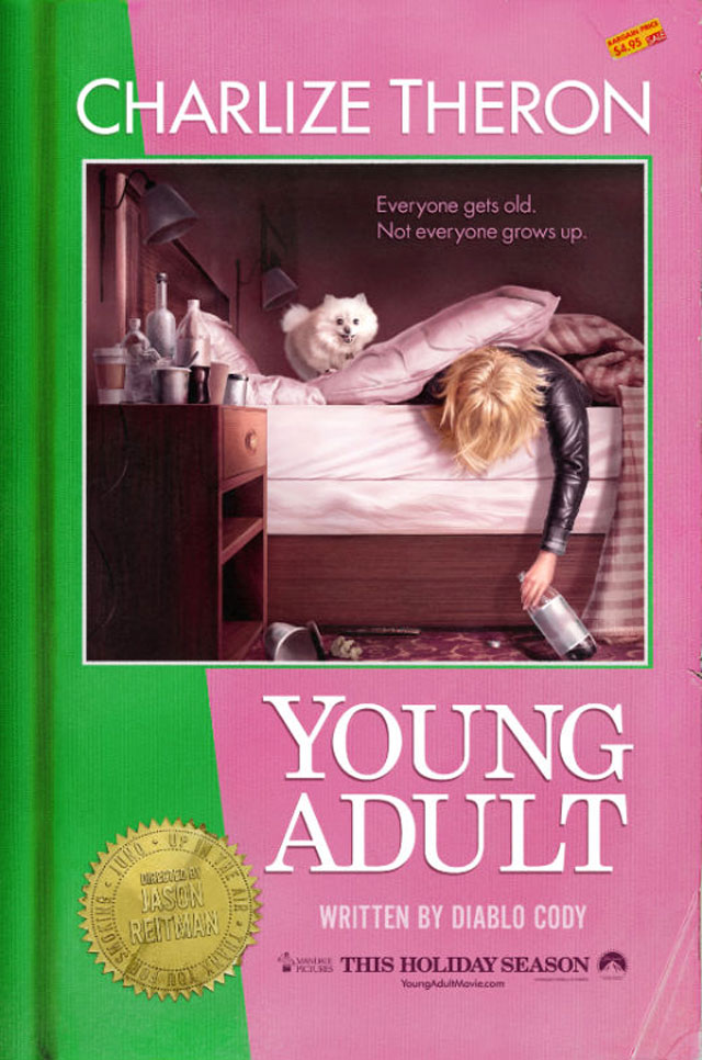
9. Young Adult
Jason Reitman is always someone I bring up as someone who understands film marketing and whose posters always look stunning and perfectly sell his films. And this one — this is one of the early ones of this decade, that’s always stuck with me I guess because of that. It’s a movie about a writer of young adult novels, called Young Adult, and they turned it into one of the covers of the books that she herself would be writing. And you just get that exactly when you look at it. And it shows you that juxtaposition perfectly by having the photo on the cover being of how much of a mess she is. You understand the film perfectly through that, and they have nice touches like the sticker with Reitman’s name and credits on it. Incredible poster.
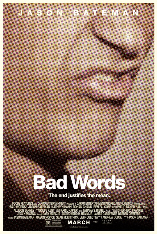
8. Bad Words
I couldn’t get this one out of my head from the moment I saw it. It’s only grown in stature for me over the decade, and is one that I continue to talk about. On a base level — it’s called “Bad Words” and you know exactly what word is about to be said by the placement of those lips. And that is just perfect. There was a time where I thought it was a bit too simplistic, but no. It’s not. It’s perfect. Because you just get it immediately and they didn’t have to do anything special. And it’s just a really memorable image because of that.
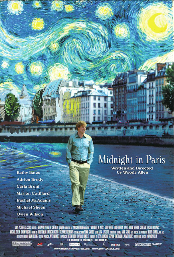
7. Midnight in Paris
Trading off Van Gogh and ‘Starry Night’, sure, but I don’t care. It’s a beautiful, memorable image. Owen Wilson walking along the Seine with the painting fading into reality. It sells the central device of the film perfectly. Woody Allen posters generally aren’t all that special, but this one really is a home run on a lot of levels (and even the film is considered to be one of his best as well). I like when something, if it is taking iconic imagery, uses it in a way to enhance its poster and actually sell the film it’s trying to sell. And this does that. It’s the total package.
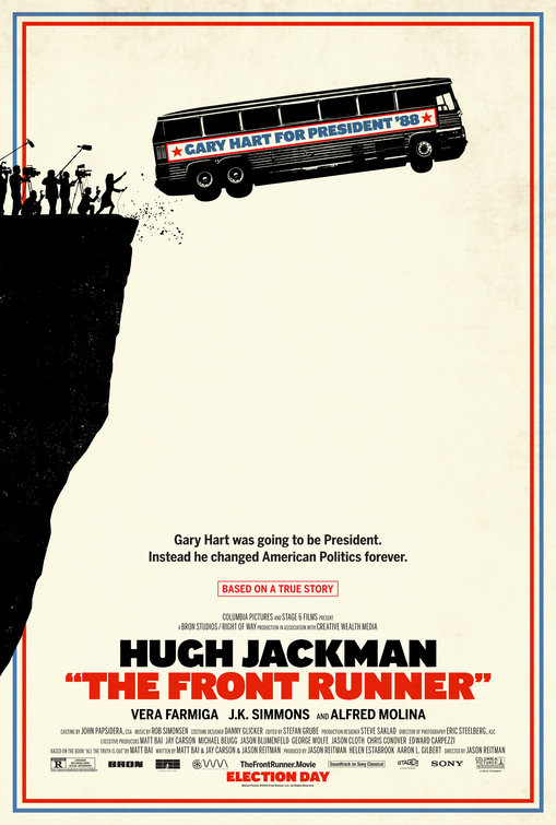
6. The Front Runner
Jason Reitman again. I love this poster so much. Because even if you don’t necessarily know the Gary Hart story, you understand this image. The tour bus with the candidate’s slogan on it is an image we all understand, and I think we all get the metaphor of driving off a cliff. So that alone, you get it. But also, the media on the edge of the cliff chasing it down also tells you a lot about what this movie and this story is, and it depends on how much you know that’ll decide how hard that lands for you, but even if you know nothing, you still sort of get it intrinsically because you understand the media. This is just so good, this poster. I’m glad I’m not sticking to hard and fast numbers because I’d have agonized forever about where to slot some of these. They could all be #1.
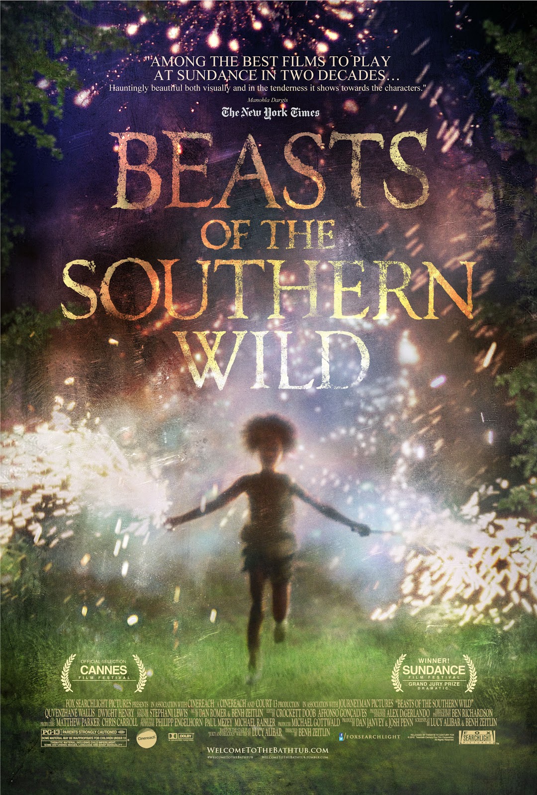
5. Beasts of the Southern Wild (2012)
Florida Project is the same thing — the pure, unadulterated joy of childhood. And I go for that. But this one… I just can’t get this image out of my head, for all these years. It’s just etched inside my brain and I love it. This isn’t an intellectual choice so much as it is a personal one based on pure beauty. There’s not much I can do to explain this image and why it works for me except — it just does. There are few poster images more memorable and touching to me from this past decade.
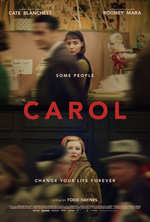
4. Carol
God, this one just gives me chills whenever I see it. This is the basis of every single romance film ever made. Ever. You don’t have the genre without this moment. Usually they refer to it as the, ‘he looks, she looks’. Here, it’s ‘she looks, she looks’. Which sells you the entirety of the film in a single image. That moment — the one I always go back to because it’s so expressive and pronounced is West Side Story, where Tony and Maria see each other at the gym and everything else in the world fades away except the two of them — you get it. They see each other through the noise and the crowds and nothing else matters. It’s a stunning image.
3. You’re Next (2013)
The most perfect marketing ever. It’s only #4 for me because you have to have your own poster to sell the film. But, assuming they did their job on that part, this is one of the best pieces of marketing on the entire decade. First, Lionsgate getting the double dip going and selling two films at once. Which is great and brilliant. Second, it’s the poster for a joyful, vapid rom com, but secretly they’re selling you this sort of underground horror movie for the people who hate that other shit and have… other tastes. Which is a great way to build the proper audience. Plus, you look at this poster (which was on bus stops and things, making it even better when you’re bleary-eyed at 7:30 in the morning and happen to notice what’s going on), and it looks like a poster you just kind of get and then you realize, “Oh shit, there’s this creepy fucking figure just standing there.” And now you’re intrigued. What is this? What is this about? It’s so brilliantly unsettling and the perfect way to sell a horror movie. Everything about this marketing is genius, aside from the fact that you don’t immediately know what they’re selling instead. But presuming they put a proper poster nearby with the figure on it as well, then you really hit the home run. But even so, this is one of the smartest things I have ever seen in a marketing campaign.
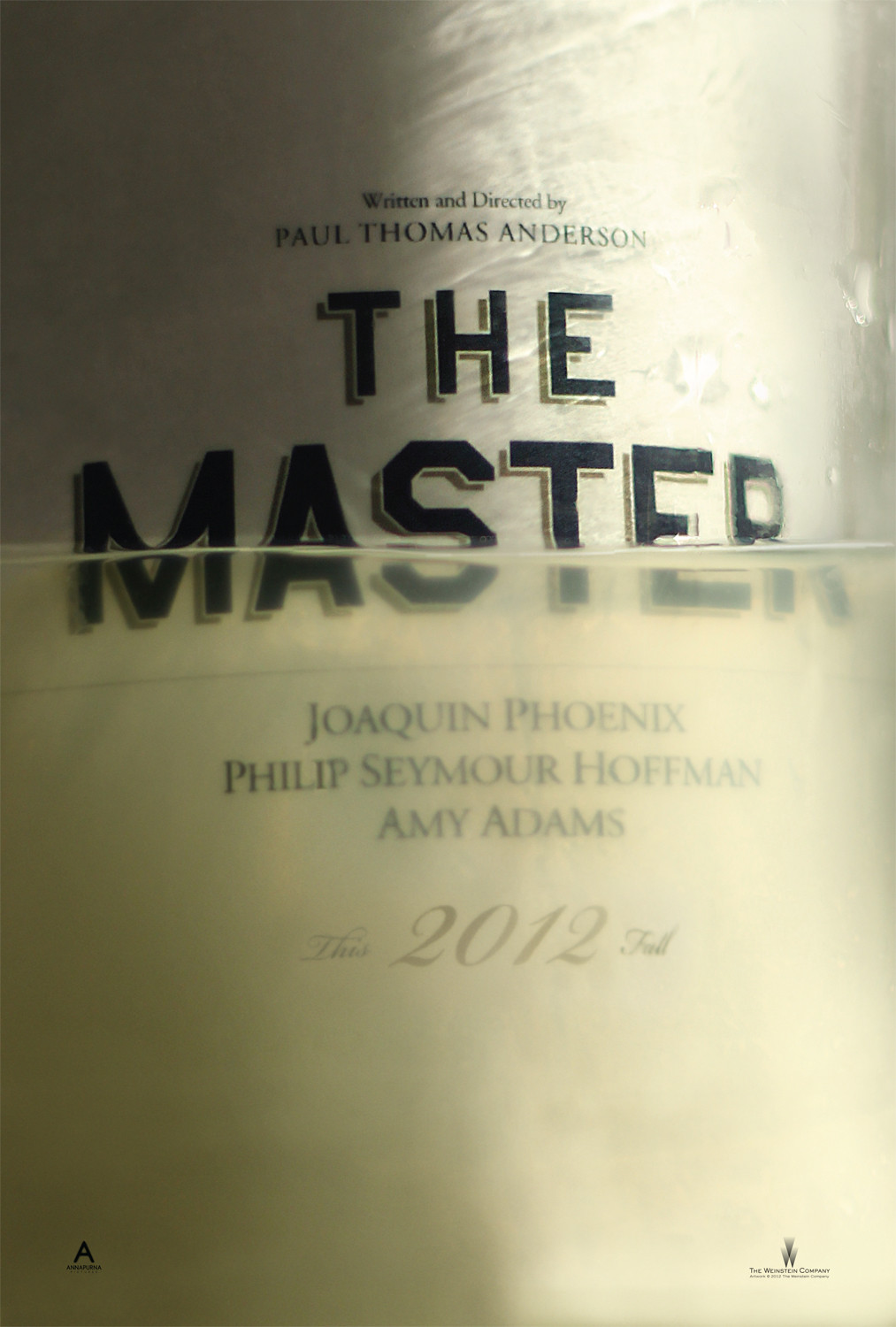
2. The Master (2012)
First, I like when a poster does something slightly different with the design. The poster that looks like a shredded document. The poster that looks like a book cover. The poster that sneaks a horror figure inside another poster. This is a poster that looks like it’s a BOTTLE. And it’s CURVED. That’s the best touch there. The title is curved and it looks like a vintage of something. I love that. And it’s presumably the fucking lighter fluid or whatever it is that Joaquin’s character makes, which makes it even better. But otherwise, it’s just a stunning-looking poster. And while you’re not really selling it on anything other than its name and who’s in it and who made it — that’s also kinda genius. “May we offer you this fine wine? Paul Thomas Anderson, Joaquin Phoenix and Philip Seymour Hoffman, from 2012?” It’s real film connoisseur shit. And I love that about it, apart from the fact that the image is just so memorable on its own.
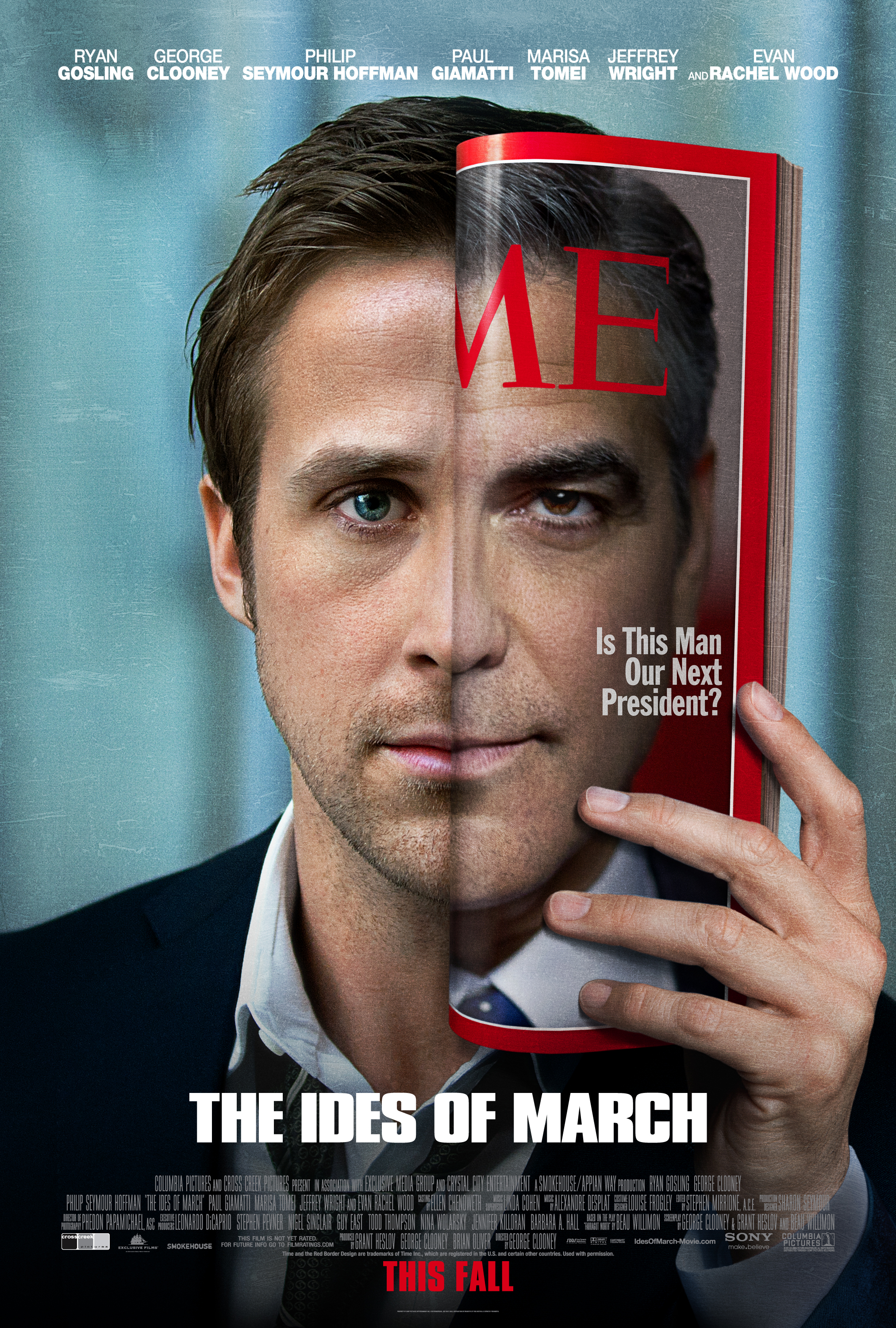
1. The Ides of March (2011)
Had to be this. This is the poster that started it all on this site and the one I will never forget because of that. It’s the reason I said “I should rank top posters”, because this one was so good that I had to talk about it and show just how well a poster could be made. Because you kinda get it. Ryan Gosling as the ambitious political consultant, taking the magazine with presidential candidate Clooney and holding it to his face. You get the All About Eve vibe going on there, and kind of what the film is about (though it’s a lot more than that). It’s just a striking, beautiful image that sells you on the film perfectly. It’s hard to get better than this, and given the significance of this image to this site, there was really no other choice for top poster of the decade for me.
– – – – – – – – – – –

Leave a comment